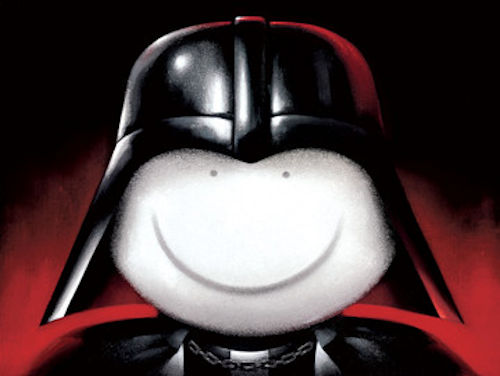
With the new Han Solo trailer out, the Star Wars Hype train is in full motion. I thought it might be an idea to review Doug Hyde’s take on a classic Star Wars Villain. This piece was for his Masters Of Disguise exhibition.

Art Style
This piece feels different to Doug’s normal style. First off it is a lot darker than the majority of his previous work. This is a clever decision as the light and colourful style probably would not work in this piece. The simplistic face makes a fantastic juxtaposition to the more realistic helmet and costume making both the Darth Vader and Doug Hyde parts instantly recognisable.
Themes
You could argue this is a celebration of both the light and dark side of the force. Whilst the face looks innocent enough (like most of Doug Hyde’s work) the composition seems to say other wise. By placing the character in the middle and having him take up so much space on the canvas it gives the impression of power and dominance. Somehow this seems both cute and menacing at the same time.
Colours
One of the things Doug Hyde is an expert in is his use of vibrant colours. This piece is no exception. The black contrasts extremely well with the white and red. The red seems very much like a fire in the way it rises up and melts into the black.small details like the helmet reflects the surrounding red really makes the costume leap from the canvas and gives extra live to the character.
Notable Elements
Despite having a simplistic style Doug Hyde manages to cram in some very clever details. The texture on the metal reflection gives the costume an almost worn look. Accessories like the chain on the cloak adds yet even more depth to this piece. It would be very easy to produce a flat piece using Doug Hyde’s style but these small details really brings the character to life.


